
UI Frameworks for Angular: New Options to Try in 2026

Cover photos by Lautaro Andreani, hmd Alvin, Tudor Baciu on Unsplash
Angular has plenty of options for building a good-looking web app. You can start with a complete set of styled components, choose individual controls for the screens you're working on, or use UI primitives to create your own design.
When we published our original list of UI frameworks for Angular, we covered Angular Material, NG-ZORRO, PrimeNG and several other libraries. Those are still useful options. However, there are some interesting additions to explore, especially if you want more control over how your app looks.
Spartan and Zard UI bring the shadcn-style approach to Angular: component code that you can add to your project and customise. Taiga UI is another library we didn't cover in the original article, with a large collection of controls for forms and more complex interfaces. It has been around for several years, so think of it as an addition to our list rather than a brand-new release.
Here are the UI libraries we'll take a look at:
- Spartan: separates component behaviour from styling, with a styled layer you keep in your own codebase.
- Zard UI: Angular components built with Tailwind CSS, with a CLI for adding their source to your project.
- Taiga UI: a modular component library with a wide selection of form controls and customisation options.
- Angular Material: Google's Material Design components and the Angular Component Dev Kit.
- PrimeNG: a broad component library with configurable themes.
- NG-ZORRO: an Angular implementation of Ant Design, with plenty of components for business applications.
We'll start with the three additions, then revisit the familiar options and where they fit.
Spartan UI
Spartan is worth exploring if you've seen shadcn-style interfaces and want that approach in an Angular app.
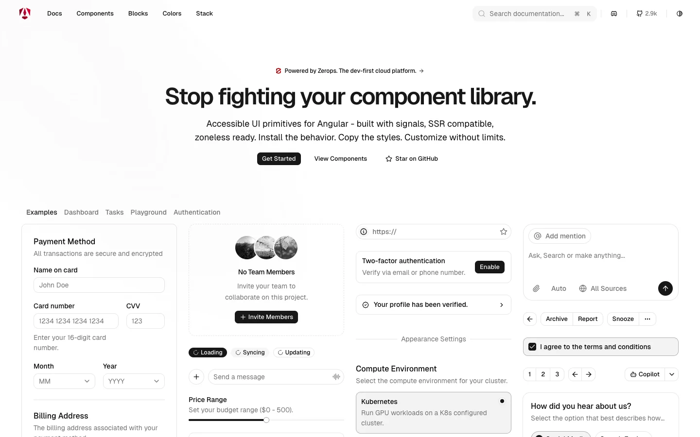
It splits its components into two parts. Brain provides the underlying behaviour, including keyboard navigation, focus management and ARIA attributes. You install it as a dependency. Helm provides the styled layer, which is copied into your project and uses Tailwind CSS.
This means you can change the appearance directly in the code you own. For example, if your design calls for a compact dialog with a different header layout, you can edit that layer while continuing to use the underlying primitive.
One of the coolest components to explore is the command menu. It gives you a searchable list of actions, similar to the command palettes you may already use in a code editor.
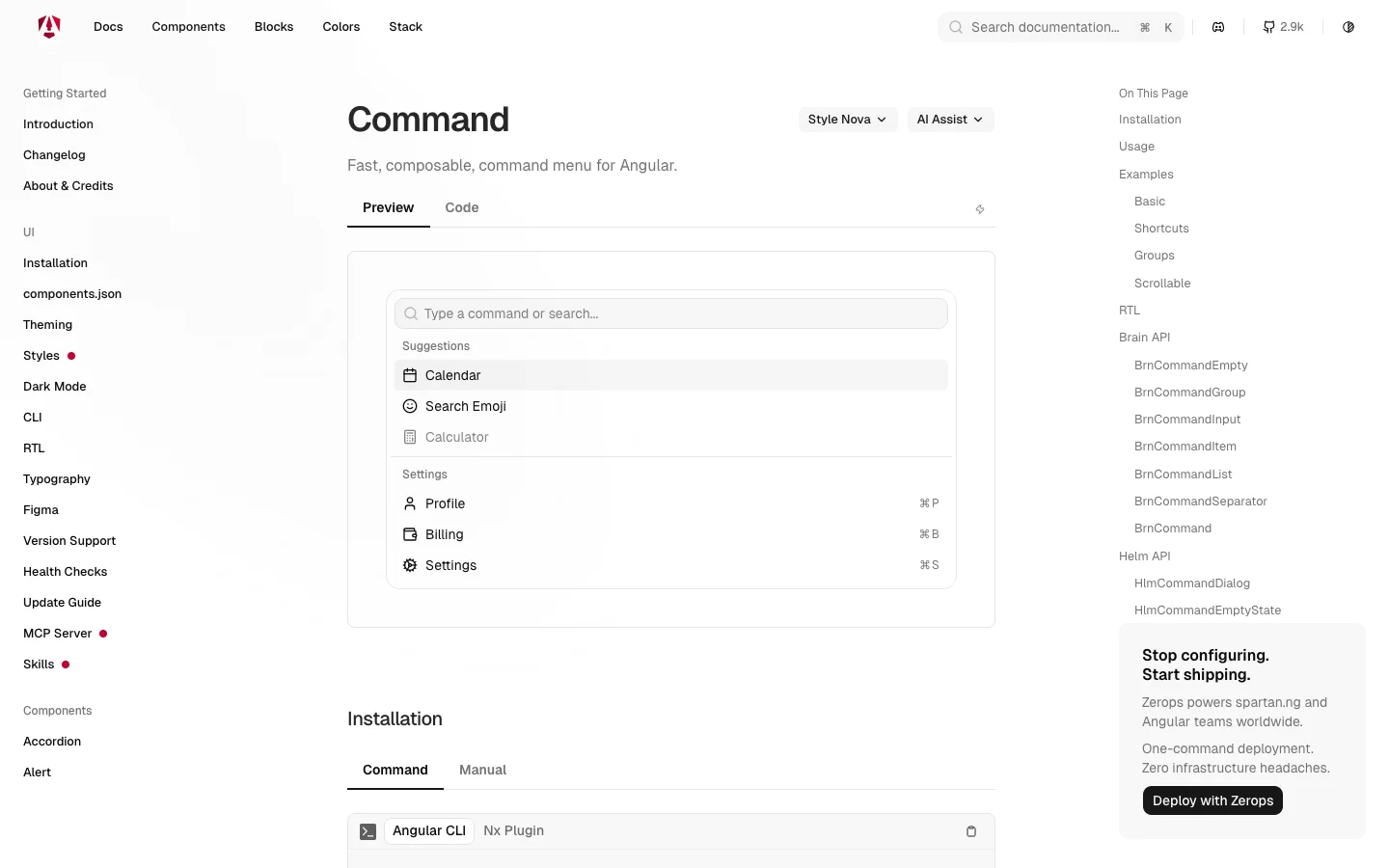
Let's say you're building a product analytics dashboard. You could add commands for opening a saved report, switching projects or inviting a teammate. Someone who uses the app every day could find the action they need without clicking through several navigation menus.
You still connect those actions to your application. The component provides the interface; your code decides what happens when the user selects “Open retention report.”
The sheet component is useful too. It presents content in a panel at the edge of the screen. You could use it to show a customer's details while keeping the customer list visible underneath, or to let someone adjust filters without leaving a report.
Spartan is especially interesting when you already have a design in mind. You get a starting point for the controls and can shape their appearance around the product.
There is some maintenance involved in keeping your own component code. When the project improves its styled components, you'll need to decide which changes to bring into your version. Spartan's update guide is a useful place to start. Keep your customisations focused so that reviewing those changes stays manageable.
Zard UI
Zard UI is another option for bringing a shadcn-inspired design to Angular. It uses Tailwind CSS and modern Angular features such as standalone components and signals.
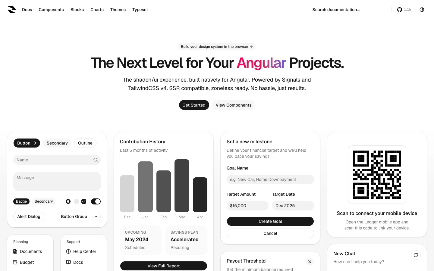
The CLI helps you initialise the project and add the components you want. Their source lives in your application, where you can inspect and modify it.
That workflow is handy when the default component is nearly right. Perhaps your product needs a particular button variant, a different spacing convention or an extra piece of information inside a card. You can make that change in the shared component and use it across your screens.
The component collection includes dialogs, comboboxes, calendars, sidebars, sheets, tables and loading placeholders. You can use those pieces to assemble the navigation and forms for a customer portal or an internal tool.
The Input OTP component is a good example of a small control that can save some fiddly UI work. It provides an interface for entering a verification code. That could fit into an email verification screen or a two-factor authentication flow.
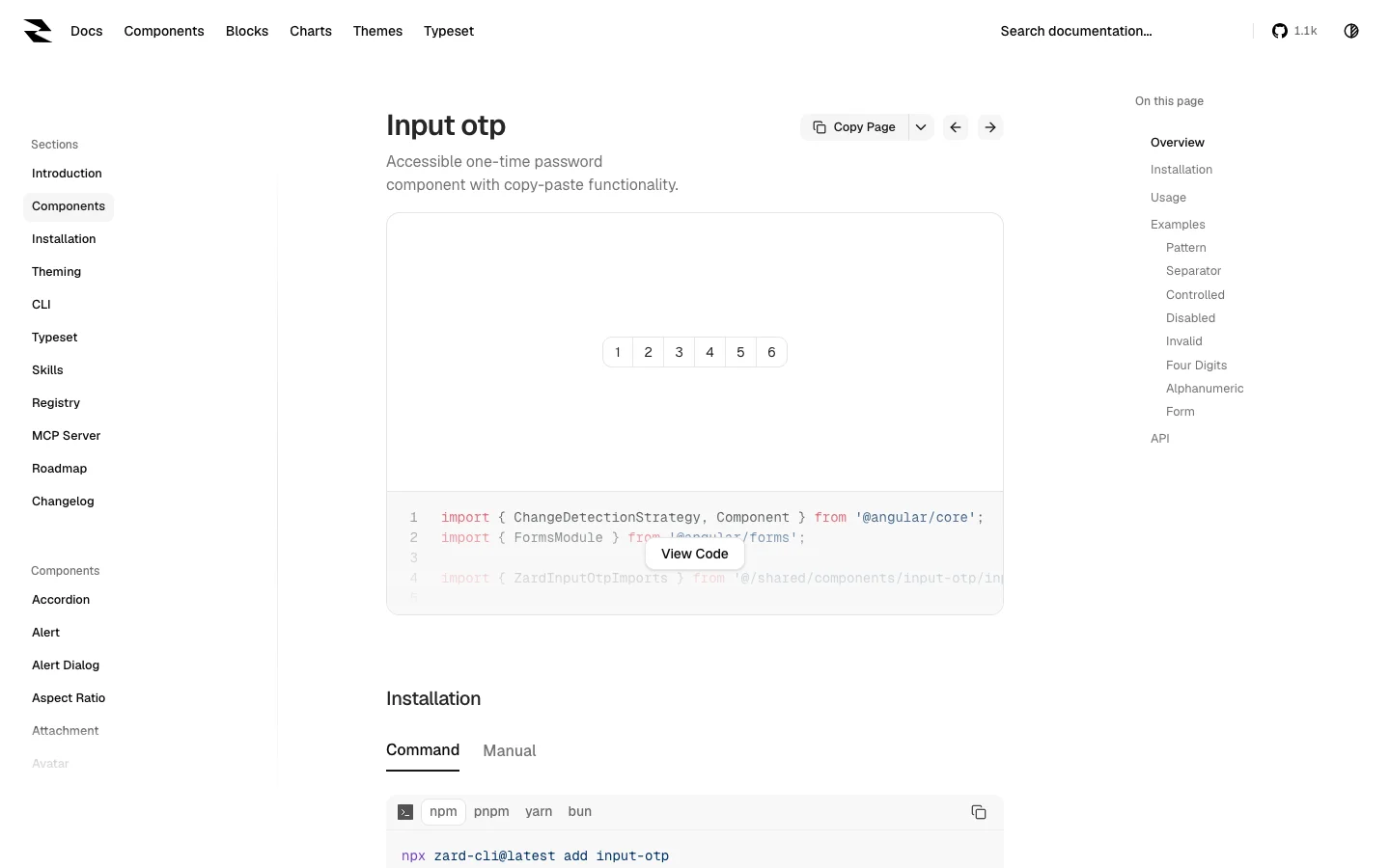
Your authentication service still generates and checks the code. The UI component handles the entry part of the experience. When trying it out, include the less pleasant cases too: an incorrect code, an expired code and someone pasting a code from their email.
Zard also has a command component, so it's worth comparing with Spartan if a searchable action menu is part of your design. Build the same small menu in both and see which API and component structure you prefer.
For example, try a menu that searches a few saved reports, groups account actions separately and shows a useful empty state. That gives you something concrete to evaluate beyond the appearance of the default demo.
Zard UI makes sense for a team that enjoys working directly with component source and Tailwind styles. As with any code you bring into your project, plan to review upstream improvements alongside your own changes.
Taiga UI
Taiga UI takes a different approach. It is a component library you install and configure, with a broad collection of controls, directives and supporting tools.
The project is modular and designed for tree shaking, so you can import the parts you use. It also supports customisation through CSS custom properties and includes dark-theme support.
The range of form controls is a good reason to explore it. Once an application grows beyond a few text fields, you start needing date ranges, multiple selections, formatted values and controls that work well together.
The InputChip component lets you represent multiple items in a field. You could use it for tags on a support ticket, a list of recipients or a set of selected player segments.
For example, a game analytics tool might let you filter a report to players on Android and iOS. Showing those choices as removable chips makes it easy to see which filters are active and remove one without resetting the whole form.
Taiga's examples include different item presentations and customisation options. That is useful when a plain string isn't enough and you want to display more context for each selection.
The InputDateRange component is another practical one. A reporting screen usually needs a start and end date, and putting those together gives users a clear way to choose the period they want to inspect.
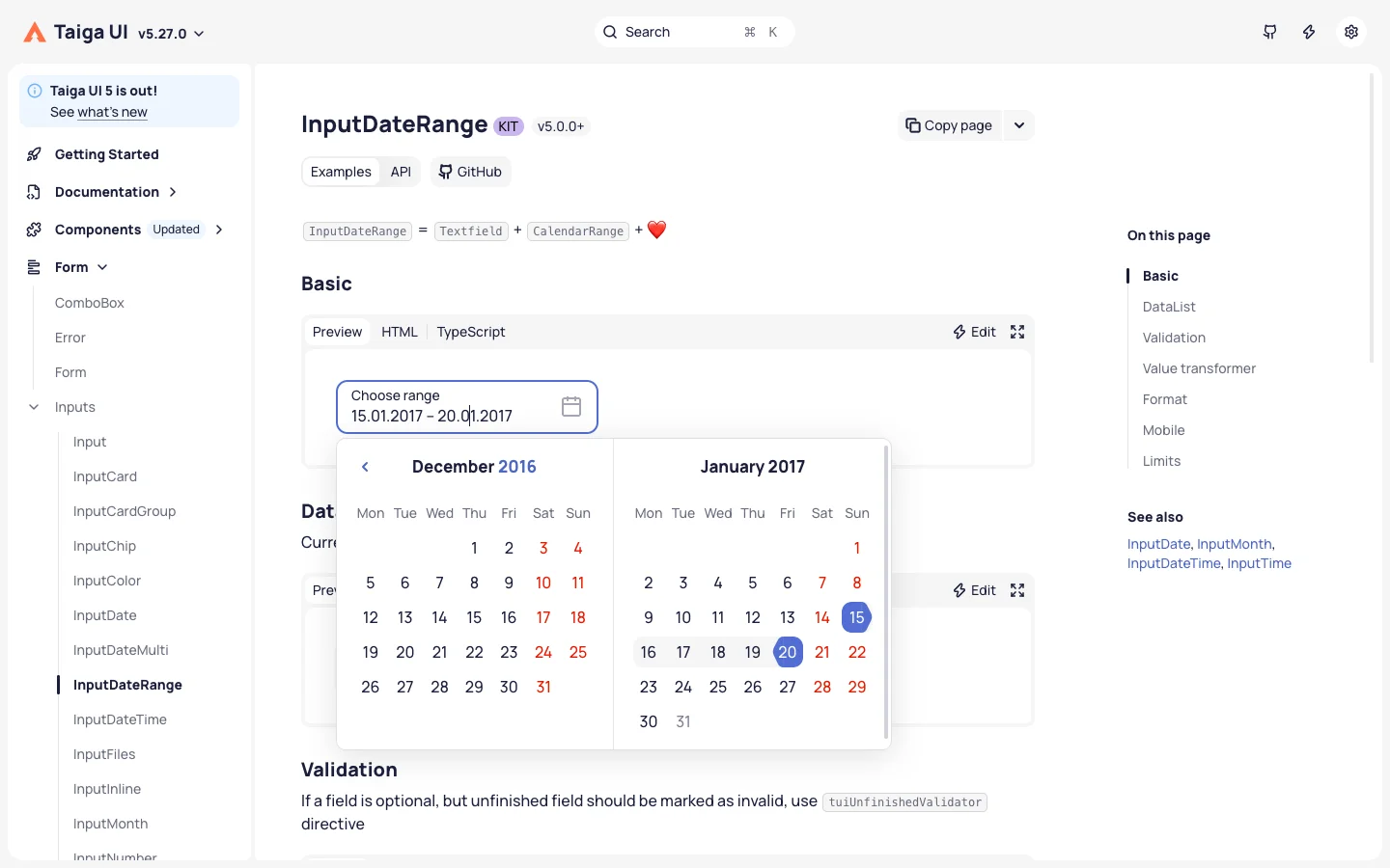
You could use it above a DAU and MAU dashboard, alongside filters for platform or country. Your application then uses those selections to request the relevant data and update the report.
When evaluating it, check how the values from the control map to your API. A date selected by a user needs a clear interpretation in the reporting system, particularly when the report includes users in different time zones.
Taiga UI is worth a closer look if your app has lots of forms, filters and selection controls. Try several related controls together on one screen. That will tell you much more than trying a button or datepicker on its own.
Angular Material UI
Angular Material remains a useful starting point for apps that suit Google's Material Design. It covers familiar controls such as form fields, buttons, menus, dialogs and tables.
For an account settings area, you can use these components to build profile forms, notification preferences and confirmation dialogs with a consistent appearance.
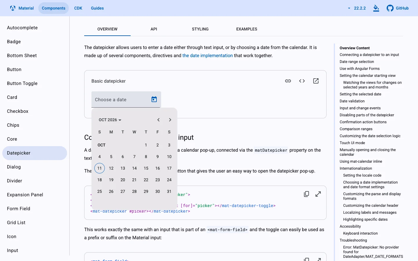
The Angular CDK, or Component Dev Kit, is also worth knowing about. It provides building blocks for UI behaviour, including overlays, drag and drop, scrolling and accessibility utilities. You can use it when you're building a custom component and need help with those interactions.
Material belongs on the shortlist when its design suits the application and the team wants a shared set of conventions. If you're planning extensive visual changes, prototype those changes on a form and a dialog before applying the library throughout the app.
PrimeNG
PrimeNG is still worth exploring when you want a wide selection of components from one library. It covers forms, data display, menus and overlays, with a theming system for adjusting the appearance.
Its styled mode uses design tokens. These let you define shared choices such as colours and component styling through a theme. Presets include Aura, Material, Lara and Nora.
For example, if you're building a customer portal, you can establish the brand colours and form appearance centrally before adding more pages. That is easier to keep consistent than styling every screen independently.
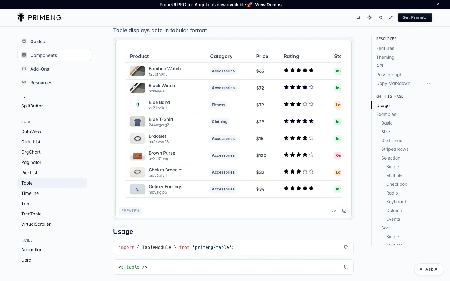
One current detail to check is charting. The chart documentation announces that its Chart.js-based components will be removed in a future release in favour of PrimeUI PRO Charts. If charts are central to your application, review that direction before choosing your implementation.
NG-ZORRO
NG-ZORRO brings Ant Design to Angular and makes its components available under the MIT licence. It is a useful option for admin interfaces and other applications with a lot of information to organise.
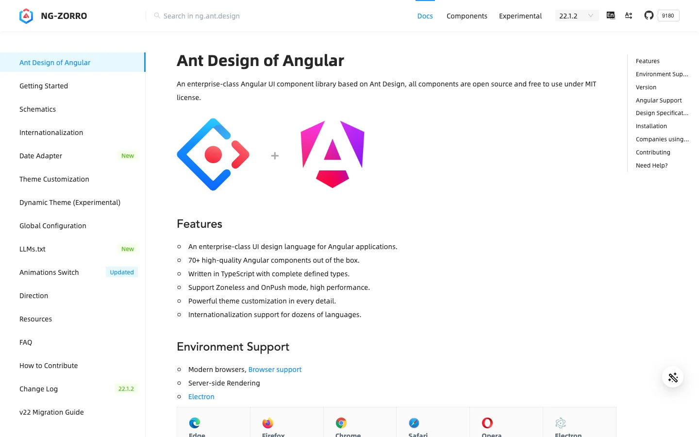
Its component catalogue includes tables, forms, drawers, trees and timelines.
A drawer could show the details of a selected order while the order list stays in the background. A timeline could display the steps taken to resolve a support request. These are useful patterns when users need context from several parts of a record.
The cascader is another interesting control. It lets someone select an item through a hierarchy, such as a department, category and subcategory.
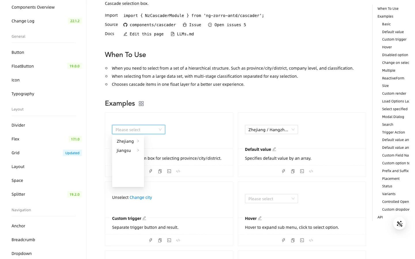
NG-ZORRO is a good one to explore when Ant Design already matches the direction of your product. Start with its more specialised controls and see how well they fit the workflows you're building.
What About Grids, Charts and Scheduling?
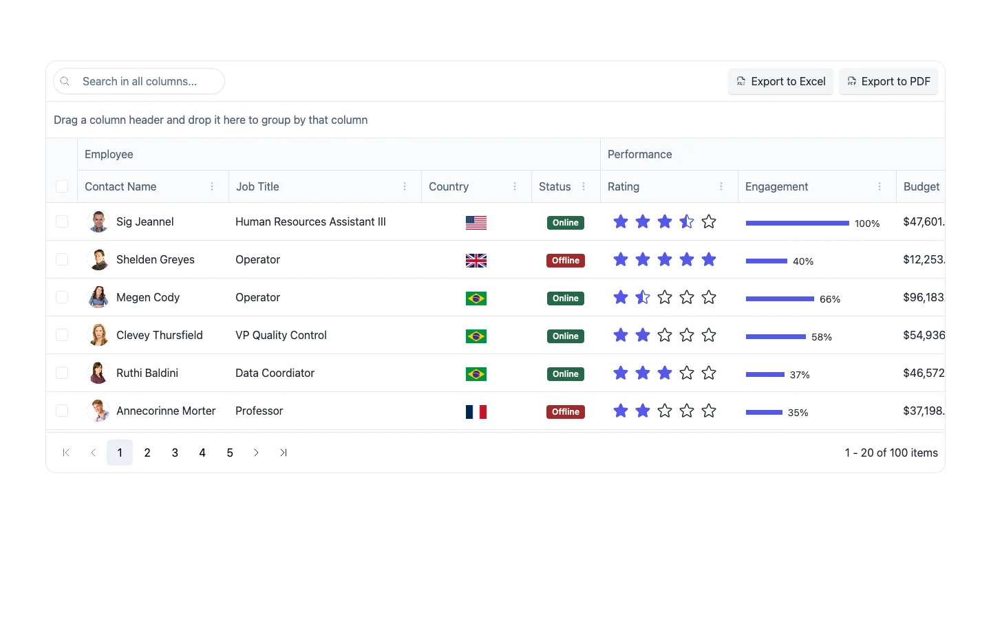
Some applications need a more specialised component suite. If your main screen revolves around a complex data grid, appointment scheduling or financial charts, the commercial libraries from our original article are still worth evaluating.
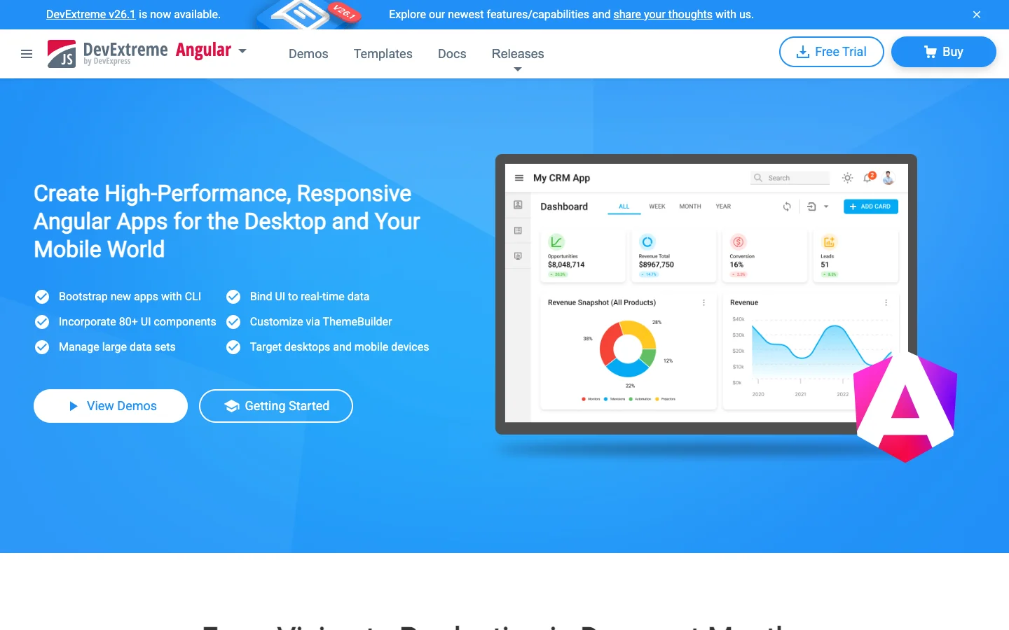
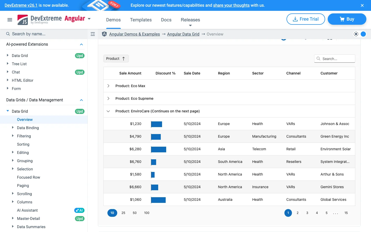
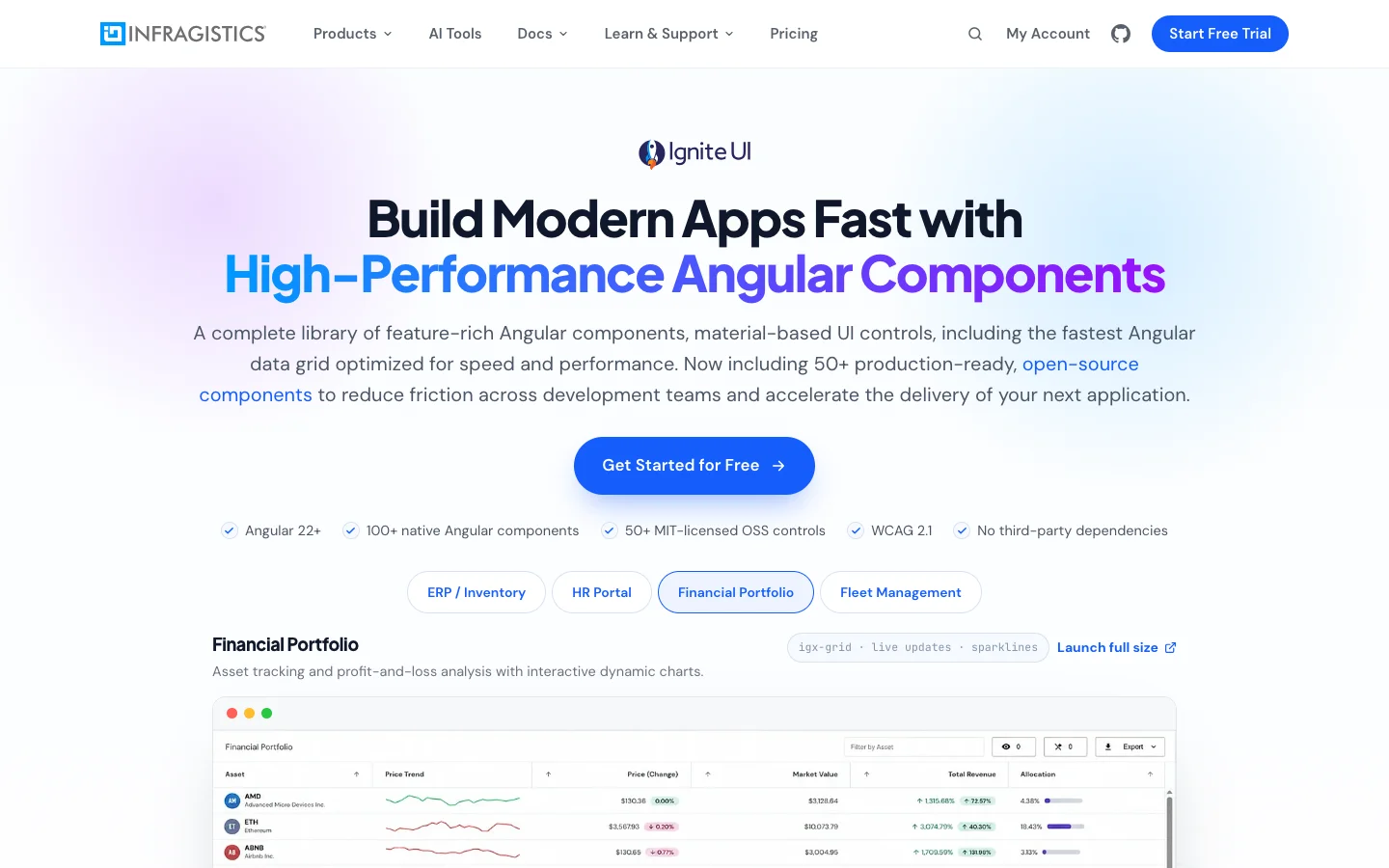
Kendo UI for Angular, DevExtreme and Ignite UI for Angular offer controls in this area. Check which features are included in the particular package and licence you're considering.
Kendo UI for Angular
DevExtreme
Ignite UI for Angular
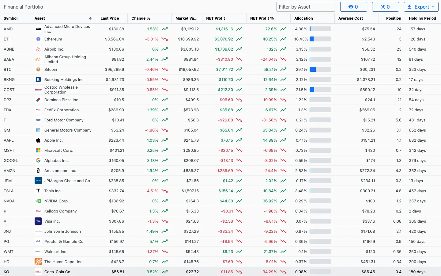
A useful evaluation is to build the busiest screen in your application. Include the filtering, editing and export behaviour users actually need. A simple table demo won't tell you whether a library can handle the workflow your finance or operations team has in mind.
Which Angular UI Library Should You Try?
If you want to customise component source and work with Tailwind CSS, start by comparing Spartan and Zard UI. If you're looking for a broad selection of configurable form controls, take a closer look at Taiga UI. Material, PrimeNG and NG-ZORRO remain useful alternatives when their components and design conventions suit the application.
Pick one real screen for the comparison. An analytics report is a good example: it might need a date range, a few filters, a results table and a dialog for saving the report.
Include loading states, validation messages and empty results. Try the screen on a smaller display and use it with the keyboard. If your app uses server-side rendering or zoneless change detection, check compatibility with the specific library version you plan to install.
You'll also want to decide how much UI code your team wants to maintain. Editing a component directly gives you flexibility, while configuring an installed library can make shared updates more straightforward.
The demos are a great place to discover interesting components. Putting a few of them together around a task your users need to complete is how you find the right fit for your Angular app.
Angular UI component comparison
Here is a grouped reference for the nine frameworks covered above. A dash means there is no separate matching catalogue entry in this comparison, not that the framework cannot build that interface. For example, a combobox can cover an autocomplete workflow, and an input component can support textareas.
Check the package and licence for the commercial suites; Ignite UI has both open-source and premium components. PrimeNG's Chart is included below, but its documentation announces its retirement, as noted above.
Layout, containers and overlays
Feedback and loading
Files, media and specialised controls
| Component | Spartan | Zard UI | Taiga UI | Angular Material | PrimeNG | NG-ZORRO | Kendo UI for Angular | DevExtreme Angular | Ignite UI for Angular |
|---|---|---|---|---|---|---|---|---|---|
| AI prompt | — | — | — | — | — | — | AIPrompt InlineAIPrompt PromptBox | — | — |
| Attachment | Attachment | Attachment | File | — | — | — | — | — | — |
| Barcode | — | — | — | — | — | — | Barcode | — | — |
| Chat | — | — | — | — | — | — | Chat | Chat | Chat |
| Chat bubble | Bubble | Bubble | — | — | — | — | — | — | — |
| File manager | — | — | — | — | — | — | — | FileManager | — |
| File upload | — | — | Input Files | — | — | Upload | Upload FileSelect | FileUploader | — |
| Hash code | — | — | — | — | — | HashCode | — | — | — |
| Image | — | — | — | — | Image | Image | — | — | — |
| Image gallery | — | — | — | — | Galleria | — | — | Gallery | — |
| Media preview | — | — | Preview | — | — | — | — | — | — |
| Mention input | — | — | — | — | — | Mention | — | — | — |
| Message scroller | Message Scroller | — | — | — | — | — | — | — | — |
| PDF viewer | — | — | Pdf Viewer | — | — | — | PDFViewer | — | — |
| QR code | — | — | — | — | — | QRCode | QR Code | — | QR Code |
| Questionnaire | Questionnaire | — | — | — | — | — | — | — | — |
| Rich-text editor | — | — | — | — | — | — | Editor | HtmlEditor | — |
| Smart paste button | — | — | — | — | — | — | SmartPasteButton | — | — |
| Speech-to-text button | — | — | — | — | — | — | SpeechToTextButton | — | — |
| Spreadsheet | — | — | — | — | — | — | Spreadsheet | — | Spreadsheet |
| Terminal | — | — | — | — | Terminal | — | — | — | — |
| Watermark | — | — | — | — | — | Watermark | — | — | — |
Inputs and selection
Data display and grids
Actions and navigation
Dates, calendars and time
| Component | Spartan | Zard UI | Taiga UI | Angular Material | PrimeNG | NG-ZORRO | Kendo UI for Angular | DevExtreme Angular | Ignite UI for Angular |
|---|---|---|---|---|---|---|---|---|---|
| Calendar | Calendar | Calendar | Calendar Mobile Calendar | — | — | Calendar | Calendar | Calendar | Calendar |
| Date and time input | — | — | Input Date Time | — | — | — | DateTimePicker | — | Date Time Editor (directive) |
| Date picker | Date Picker | Date Picker | Input Date | Datepicker | DatePicker | DatePicker | DatePicker | DateBox | Date Picker |
| Date range input | — | — | Input Date Range | — | — | — | DateRange | DateRangeBox | Date Range Picker |
| Date text input | — | — | — | — | — | — | DateInput | — | — |
| Gantt | — | — | — | — | — | — | Gantt | Gantt | — |
| Month picker / input | — | — | Calendar Month Input Month | — | — | — | — | — | Month Picker |
| Multiple-date input | — | — | Input Date Multi | — | — | — | — | — | — |
| Range calendar | — | — | Calendar Range | — | — | — | MultiViewCalendar | — | — |
| Scheduling | — | — | — | — | — | — | Scheduler | Scheduler | — |
| Time input | — | — | Input Time | Timepicker | — | TimePicker | TimePicker | — | Time Picker |
| Year input | — | — | Input Year | — | — | — | — | — | — |
Charts and visualisation
| Component | Spartan | Zard UI | Taiga UI | Angular Material | PrimeNG | NG-ZORRO | Kendo UI for Angular | DevExtreme Angular | Ignite UI for Angular |
|---|---|---|---|---|---|---|---|---|---|
| Arc gauge | — | — | — | — | — | — | ArcGauge | — | — |
| Bar gauge | — | — | — | — | — | — | — | BarGauge | — |
| Bullet graph | — | — | — | — | — | — | — | Bullet | Bullet Graph |
| Chart axes / legend | — | — | Axes Legend Item | — | — | — | — | — | — |
| Chart wizard | — | — | — | — | — | — | Chart Wizard | — | — |
| Charts | Chart | Chart | Arc Chart Bar Bar Chart Bar Set Line Chart Line Days Chart Pie Chart Ring Chart | — | Chart (retiring) | — | Chart | Chart PieChart | Charts Bar Chart Line Chart Pie Chart |
| Circular gauge | — | — | — | — | — | — | CircularGauge | CircularGauge | — |
| Diagram | — | — | — | — | — | — | Diagram Workflow Diagram | Diagram | — |
| Financial chart | — | — | — | — | — | — | Stockchart | — | Stock (Financial) Chart |
| Funnel | — | — | — | — | — | — | — | Funnel | — |
| Linear gauge | — | — | — | — | — | — | LinearGauge | LinearGauge | Linear Gauge |
| Map | — | — | — | — | — | — | Map | Map VectorMap | Geographic Map |
| Polar chart | — | — | — | — | — | — | — | PolarChart | Polar Chart |
| Radial gauge | — | — | — | — | — | — | RadialGauge | — | Radial Gauge |
| Range selector / chart zoom | — | — | — | — | — | — | — | RangeSelector | Zoom Slider |
| Sankey | — | — | — | — | — | — | Sankey | Sankey | — |
| Sparkline | — | — | — | — | — | — | Sparkline | Sparkline | Sparkline Chart |
| Treemap | — | — | — | — | — | — | — | TreeMap | Treemap Chart |